What Is A Squeeze Page? Best Practices, Tips, And Examples

A squeeze page is a digital marketer’s secret weapon—a hyper-focused page that collects email addresses to convert visitors into leads. Imagine a digital doorkeeper who only lets subscribers through to your VIP content.
That’s your squeeze page, standing guard, clipboard in hand, ready to offer exclusive, premium content in exchange for contact details, making your visitors feel like they’re part of an elite group.
This article brings together the most effective tactics from top marketing experts. It provides you with closely related actionable tips that have been proven to work, instilling confidence in your ability to create a successful squeeze page.
So, if you’re looking for:
- A clear and simple explanation of what a squeeze page is and its core purpose.
- Essential Components of a Great Squeeze Page
- Proven techniques for creating high-converting squeeze pages.
- How to design a short, easy-to-complete form that maximizes opt-in rates.
- Real-world examples of high-converting squeeze pages for inspiration and to see best practices in action.
This guide is not just for you, it’s a powerful tool that can transform your lead generation strategies, inspiring you to create a high-converting squeeze page that drives results.
What Is A Squeeze Page?

A Squeeze Page (also known as a “lead capture page” or “opt-in page” ) is a landing page focused on capturing contact details, such as emails, from your website visitors. Consider it a trade point where you offer a valuable resource, known as a “lead magnet,” like a free ebook, comprehensive guides, or training videos in exchange for their contact information.
Squeeze Page serves as the entryway into various sales funnels:
Let’s say a squeeze page is a welcoming host at a party. It greets guests (visitors), offers them a gift (lead magnet), and adds them to the guest list (email list) in return for their details. Remember:
- They streamline leads into funnels.
- Offer valuable incentives to visitors.
- It’s a staple for successful online ventures.
It’s like opening a treasure chest; you give something small (contact info) and receive useful goodies! 🎁
Note: Pop-up or Sticky Bar can also capture leads (think name and email), but they’re not a Squeeze Page.
Is A Squeeze Page The Same As A Landing Page?
Squeeze Page is a type of landing page.
Think of a versatile and multifunctional landing page as a Swiss Army knife. It can sell products, book appointments, and do other useful things.
In contrast, a squeeze page is like a laser beam, honed in on the singular lead generation mission through email capture.
Look at the table below to clearly illustrate the differences between squeeze pages and landing pages:
Feature | Squeeze Page | Landing Page |
|---|---|---|
Purpose | Solely focused on capturing email addresses | Can have various goals: sales, appointments, downloads, etc |
Design | Minimalist, focused on the offer and form | May be more complex, including testimonials, features, etc. |
Content | Short, persuasive copy, image of the offer | Can include more text, product details, comparisons, social proof, guarantees, etc. |
Calls To Action (CTA) | One clear CTA: email signup | May have multiple CTAs depending on the goal |
How To Create A High-Converting Squeeze Page?
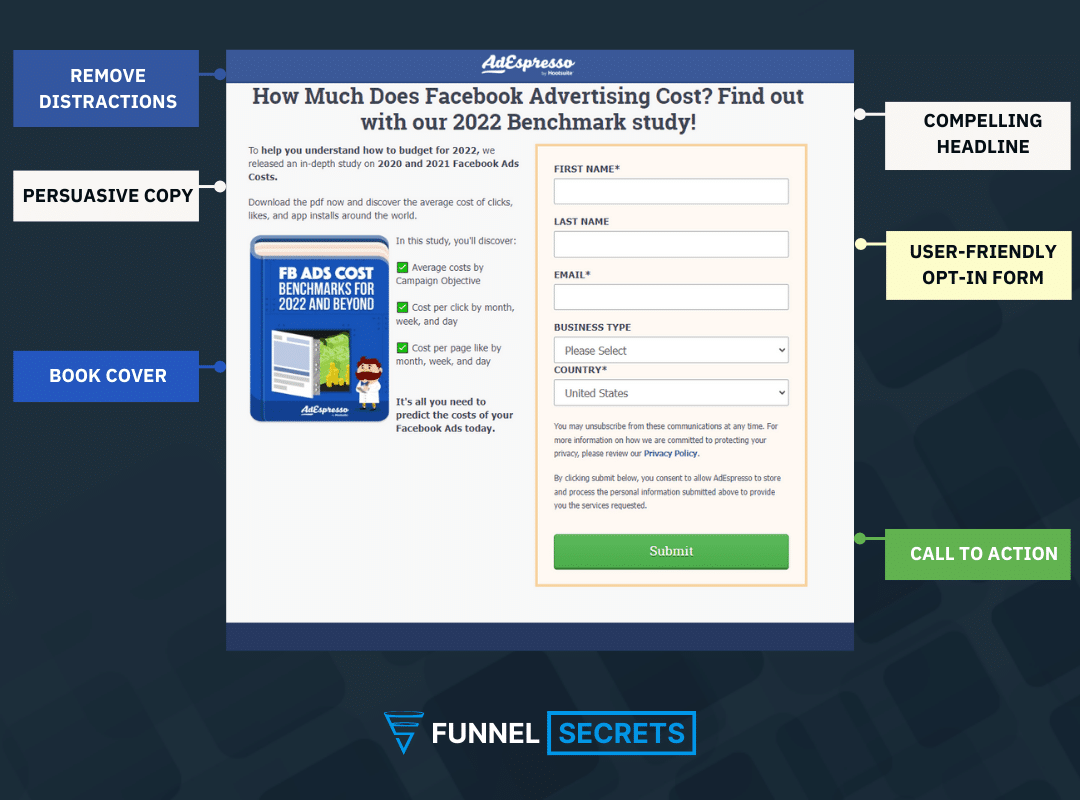
Crafting a high-converting squeeze page is like preparing a gourmet dish. You need the right ingredients, a touch of creativity, and a dash of strategy.
Follow these 7 steps, each with its own unique purpose and strategy, to turn your page visitors into subscribers like a pro. These steps include:
- Creating an irresistible offer.
- Writing a compelling headline.
- Designing an attention-grabbing form.
- And more.
Step 1: Create An Irresistible Offer
Before anything else, your squeeze page needs an offer people can’t refuse. It’s NOT just about a lead magnet, but about solving a REAL, immediate problem for your target audience. Think about:
- Quick Win Guide: Give them that one actionable thing they can implement today for a small but satisfying result. For example, if you’re a digital marketer, you could offer a guide on ‘5 Quick SEO Fixes for Instant Traffic Boost ‘.
- Micro-Commitment Template: A super-easy-to-fill template that takes a big task and breaks it into a bite-sized step they can’t say no to.
- Video Training: A short or in-depth training showcasing a specific technique or strategy from your expertise.
- Voucher/Discount: A money-saving offer on your coaching calls or a mini-consultation focusing on problem-solving.
Your lead magnet must go beyond the ordinary to connect with your audience. Provide exclusive expert advice or solutions that directly address their most pressing problems.
Finding the perfect offer for your website can feel like a thrilling treasure hunt!
You’re on a mission to discover what your visitors want, and each clue you uncover brings you closer to your goal of creating a high-converting squeeze page.
But guess what?
Finding the good stuff is figuring out what your visitors want. Think of yourself as a detective trying to solve a mystery!
Here’s how to do it:
1. Go undercover in online communities: Infiltrate forums (Reddit, Quora) and niche Facebook groups where your audience hangs out.
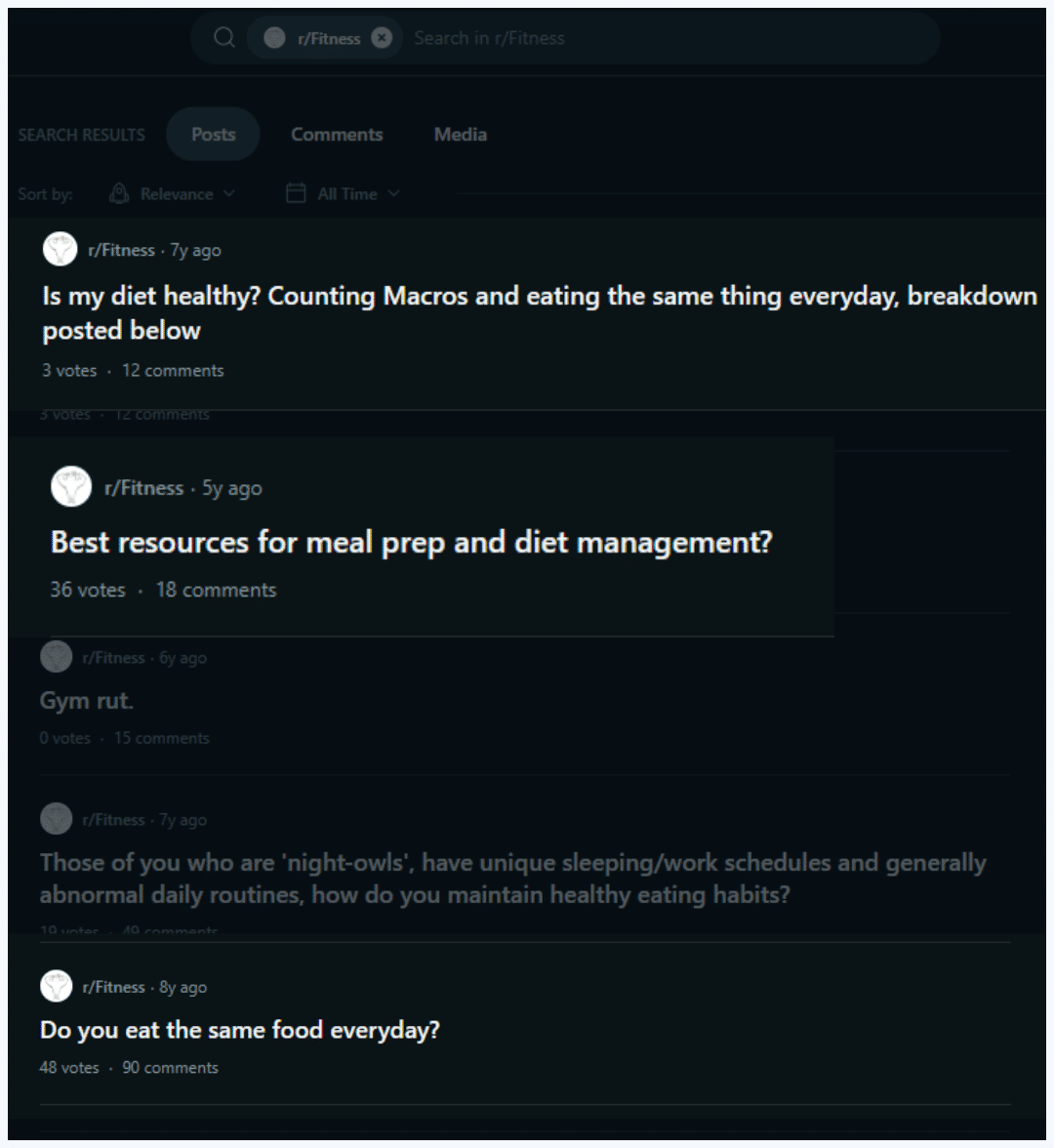
- Look for discussions about their pain points
- Questions they frequently ask
- and the type of content they engage with the most.
This will give you valuable insights into their needs and preferences.
For example, if you’re a fitness marketer, you might discover a recurring struggle with “meal-prepping boredom” in weight loss groups.
2. Spy on the competition (ethically!): Analyze popular courses within your niche on Udemy, Coursera, etc.
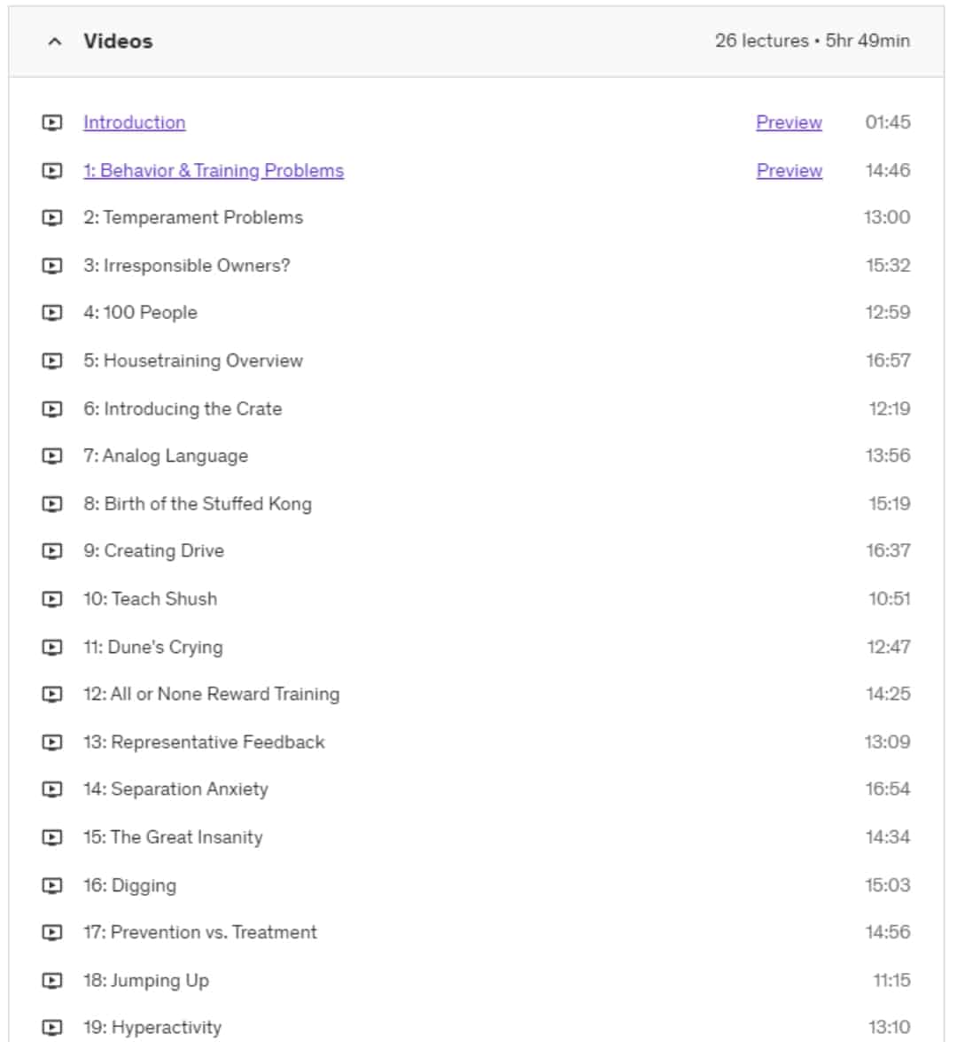
- Peek at the Table of Contents: This is like a treasure map for what people are most interested in learning. Are there entire sections on a specific topic? That hints that people are hungry for information in that area.
- See what students are raving about: Reviews often mention what people found most valuable in a course. Look for patterns—are there topics consistently mentioned as helpful?
By using this detective work, you can uncover exactly what kind of information your target audience craves.
This is gold for creating your next lead magnet. It directly addresses their burning desire to learn, like offering them a free mini-course on a hot topic!
3. Become the lighthouse, not just another ship: Position your squeeze page as the ultimate solution to their discovered needs.
Instead of a generic “fitness tips” offer, craft something enticing like “The 5-Ingredient Meal Prep Blueprint for Busy Professionals”.
This speaks directly to your audience’s pain points with a promise of ease and convenience.
Now that you’ve snagged a killer idea, you must build your offer.
This is not a “HoW To CREate a LEad MAGnet“ article. We’re here to cut through the BS and build a high-converting squeeze page.
OK, now we go to step 2!
Step 2: Write Your Headline

Your squeeze page headline is your mission-critical first impression. It’s the first thing your visitors see, and it will either convince them to stay and learn more or leave.
A compelling headline should be bold, benefit-driven, and hint at exactly what the reader will gain by opting in. It should be like a movie trailer that entices the audience to watch the full film.
Here’s your checklist for a killer headline:
- Quantify the results: Specific numbers or promises. Think results, not vague features.
- Tease the transformation: What pain point do you solve? Hint at the solution without giving it all away.
Let’s dissect those examples:
Unbounce: “12 Proven Ways to Convert with Overlays”. It’s specific (12 ways), promises a clear result (conversions), and uses the power word “proven.”
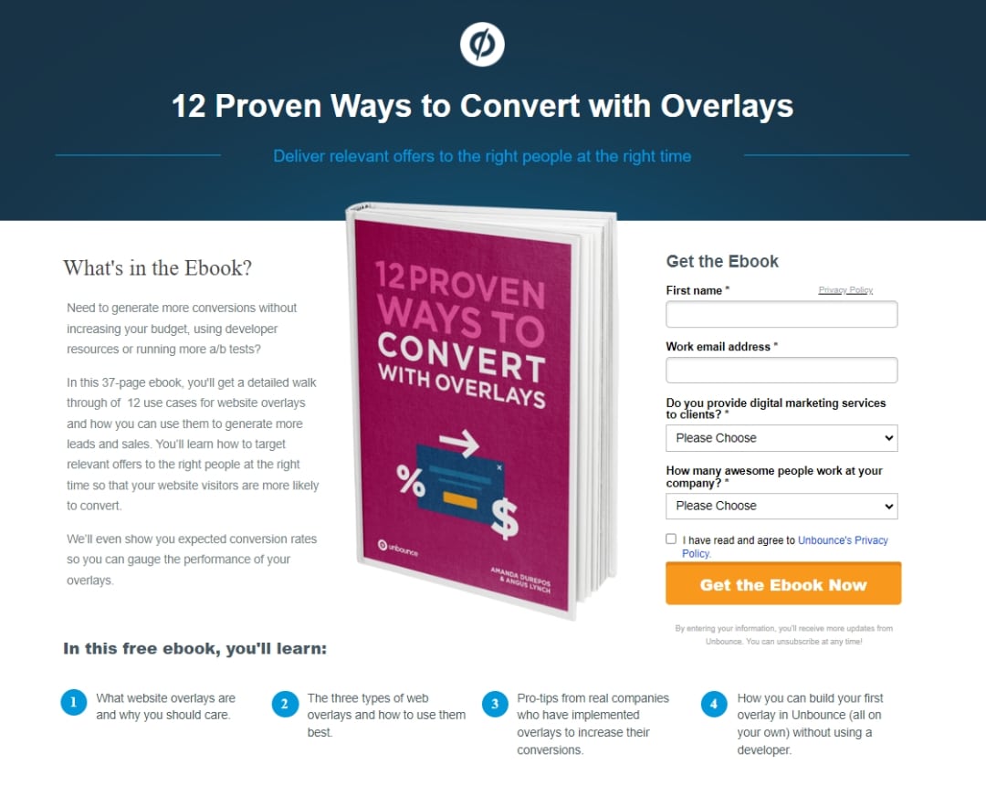
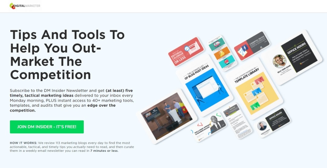
Digital Marketer: “Tips And Tools To Help You Out-Market The Competition” This taps into ambition and offers strategic tools for outperforming the competition.
Here are a few headline formulas you can use:
1. “How To” Headlines
How To _____ Without _____
E.g., How To Stop Working For A Boss Without Having To Write A New Book Every Week
How To _____ So You Can Avoid _____
E.g., How To Serve In Special Operations So You Can Avoid Worrying Whether You’re On The Right Path Or Not
How to _____ – No experience required
E.g., How to become financially independent – No experience required
2. X# Ways To Get Headlines
X# _____ Ways To _____ Faster Than You Ever Dreamed Possible
E.g., 5 Surefire Ways To Crush Fitness Test Faster Than You Ever Dreamed Possible
X# Quick And Easy Ways To _____
E.g., 5 Quick And Easy Ways To Reach Financial Independence Through Online Sales
3. Mistakes Headlines
The TOP _____ Mistakes _____ Make… and How To Avoid Them!
E.g. The TOP Stock Market Research Mistakes Beginner Investors Make… and How To Avoid Them!
_____ Mistakes All _____ Need To Avoid!
E.g., 3 Potty Training Mistakes All Puppy Parents Need to Avoid!
Pro Tip: Need help to nail the perfect headline? Funnel Scripts’ free version can generate 243+ variations in 60 seconds (or less), giving you a massive pool of inspiration.
Step 3: Reveil What’s Inside The Box

You’ve got their attention – now it’s time to convert. Ditch vague promises; be ultra-clear about what’s in your lead magnet and why they need it. Here’s how:
- Itemize the benefits: Ebook? List the key takeaways. Course? Outline the modules and the results they’ll achieve.
- Transparency = trust: The more upfront you are, the more credible you’ll seem.
Remember, your goal is to make saying “yes” a no-brainer!
For example,
Look at Carrot’s Squeeze Page:
”600+ highest profit motivated seller keywords, the results from the biggest investor PPC study analyzing more than 3 million PPC search terms and 5,500 house seller leads, and how to consistently convert with PPC.”

Why does it work?
- Targeting: This description focuses on a highly specific audience: real estate investors using PPC. They immediately know it’s relevant to them.
- Data-Driven: The emphasis on numbers (“600+,” “3 million,” “5,500”) reinforces the report’s value and the level of research behind it. This appeals to investors’ analytical mindset.
- Action-Oriented: “How to consistently convert” speaks to investors’ desire for bottom-line results.
On the other hand, Nomadic Math gives us 5 reasons why we should download their free guide.
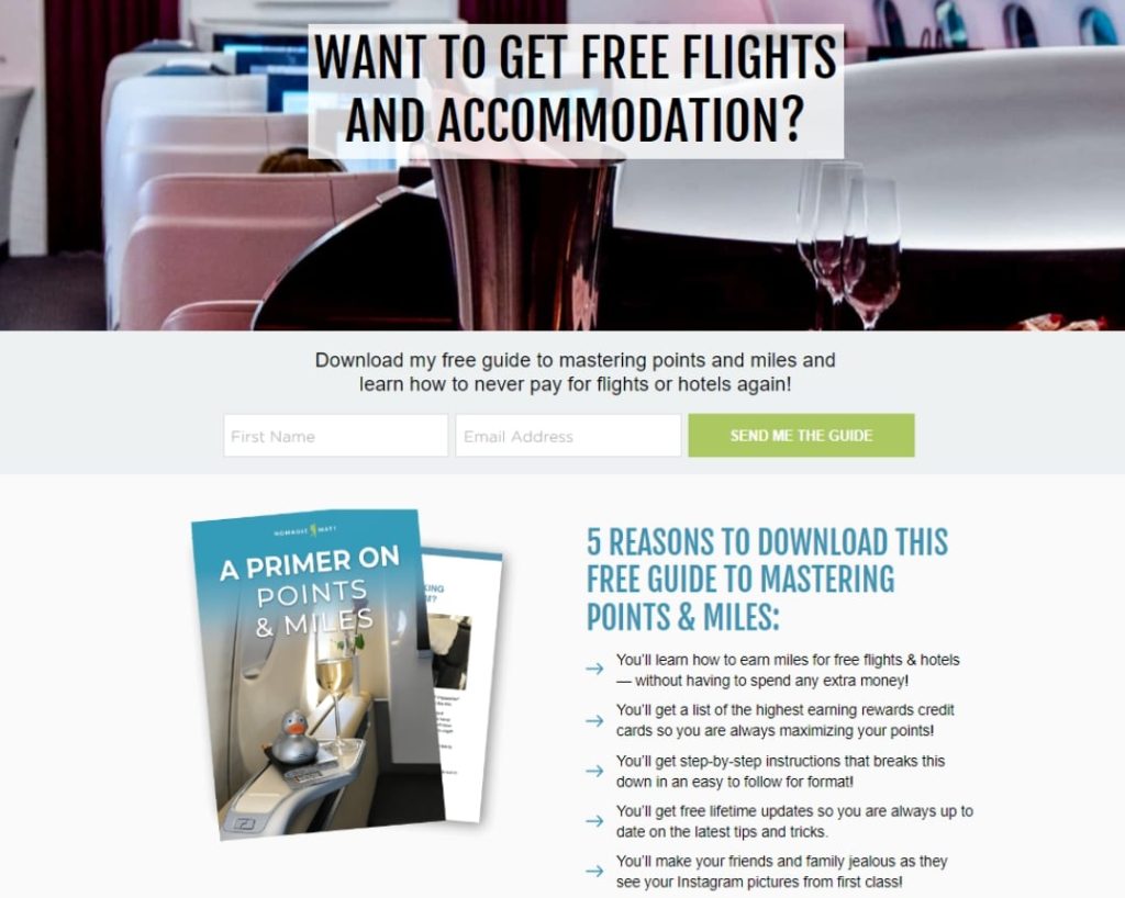
Why does it work?
- Powerful Desire: The promise of “never pay for flights or hotels again” addresses a universal dream. This instantly hooks potential readers.
- Credibility Building: The phrase “mastering points and miles” adds authority. Many people find loyalty programs confusing, so this implies a solution to that problem.
As you can see, both examples demonstrate that detailed offers are more compelling than vague ones. They focus on how the lead magnet solves a pain point or fulfills a major desire for the target audience.
Don’t forget to use data, numbers, or testimonials to build trust and reinforce the value of your offer.
Step 4: Add Your Video or Graphic

Want to make your squeeze page super cool?
Add a video of yourself explaining stuff!
No time to film? No problem!
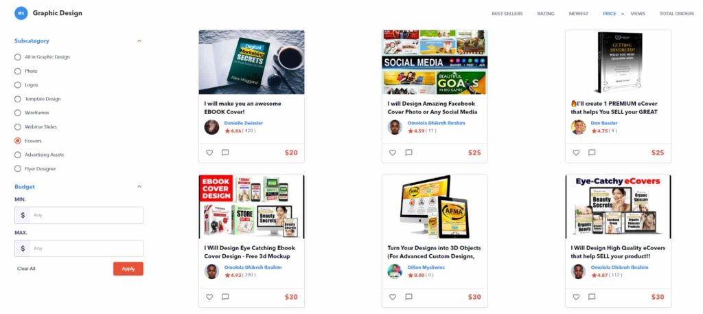
A fancy 3D book cover or picture of your course lessons works, too. If you don’t want to design it yourself, check out Fiverr or Funnel Builder Marketplace. They have people who can make awesome covers for #Not-A-Lot-Of-Money!
Love the DIY spirit? If you’re a go-getter who wants total control, Pyks is your creative sidekick.
Your ebooks or courses look awesome without a huge design headache, guarantee!
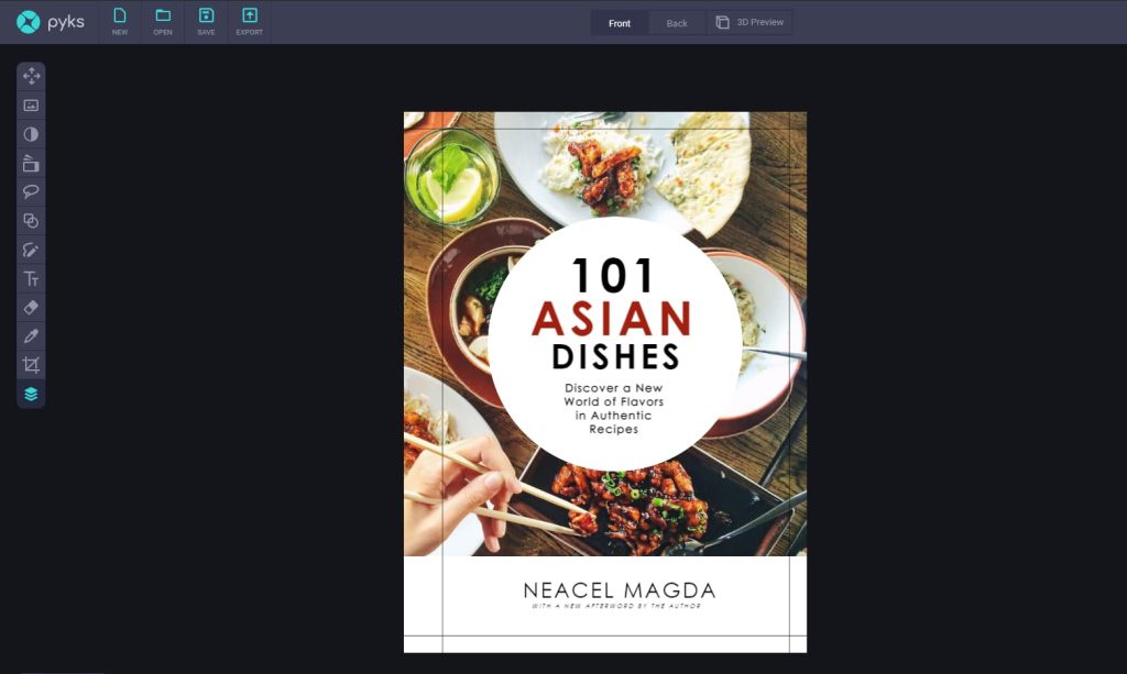
Think of Pyks like Canva’s superpower cousin for eCovers. It’s got cool 3D templates and stuff that make your work pop! If you can rock Canva, Pyks is a breeze.
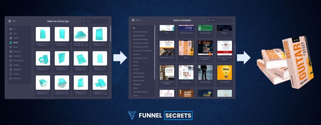
The best part?
Instead of paying $49/month, you can snag Pyks for FREE as part of the One Funnel Away Challenge (seriously, it’s a steal!).
Imagine transforming your titles into eye-catching magnets that make people think, “Whoa, I need to check this out!”
Pro Tip: Be bold and play around! Experiment with colors, fonts, and even a little sparkle (who doesn’t love some sparkle✨?). Creating with Pyks should be as fun as leveling up in a video game.
Step 5: Design A User-Friendly Opt-In Form

Most of the time, all you need is an email address. If you want to personalize emails, you might need a first name.
Every extra field is an extra hurdle, and people are lazy (hey, no judgment; we all are sometimes!). The more hurdles, the less likely they will stick around and fill out the form.
Imagine you’re at a party and meet someone super interesting.
You want to be friends, right? But what if they ask you to complete a 20-question survey before you can chat?
Feels a bit much, right?
That doesn’t mean long-form with tons of fields doesn’t work.
For example, HubSpot gathers more information upfront to better understand and segment its audience. This lets it send more targeted, relevant content and offers later.
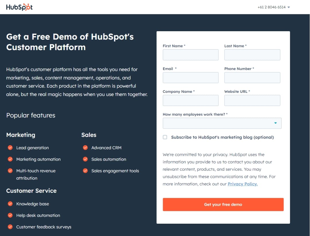
When should marketers consider using long forms?
- High-value transactions: A detailed application makes sense if someone is applying for a mortgage. This crucial information will help them because they’ve already invested.
- Complex data collection: Some services (like setting up a detailed investment portfolio) might require much upfront information.
- When you can ABSOLUTELY justify it: If the value of the information outweighs the potential conversion loss, and your audience expects a longer form, it could be worth a try.
The Golden Rule: If You Can’t Justify It, Ditch It Always ask yourself: “Do I absolutely need this piece of information right now?” If the answer isn’t a resounding yes, leave that field out. You can always gather more data later through progressive profiling or other methods.
Step 6: Include A Strong Call To Action

Ensure your call to action (CTA) button is big enough that nobody misses it. But don’t go overboard and make it the size of Texas. You want it to stand out but not block the view of all the other cool stuff on your landing page.
Here’s a tip: use colors that clash well, like a bright orange button on a cool blue background. And use a font that’s easy to read, even for your grandma, who last got new glasses a while ago.
Finally, personalize it with a little “you” and “your“ magic.
Instead of a boring old “Register Now” button, try something like “Yes, I Want FREE Access” or “Save Your Spot Today For FREE“
See the difference?
It’s like you’re whispering sweet nothings straight into the reader’s ear, telling them exactly what they want to hear.
Step 7: Optimize For Mobile Devices

Let’s face it: Everyone’s glued to their phones (and you might be targeting those scroll-stopping social media ads to exactly these people).
Smaller screens, fewer taps, and slower loading times are the name of the game on mobile.
To win over these impatient mobile users, you must ensure your landing page is mobile-friendly.
That means your layout needs to shift and bend to fit those tiny screens, your CTAs should be big and bold (because thumbs are not always the most precise tools), and any images might need to shrink or disappear completely.
The key is to ensure that your message is clear and your offer is irresistible, no matter what device someone uses to browse.
Squeeze Page Optimization Tips
1 Remove Distractions
Your squeeze page focuses on getting that email address!
So, ditch anything that might distract your visitors.
No random links, no navigation menus, not even a sneaky link back to your homepage.
Your squeeze page will work best if it stands alone.
You want them glued to that signup form. Make your squeeze page distraction-free, and those leads will start rolling in. 😉
2. Include (authentic) social proof
Most people can smell generic marketing fluff a mile away.
They’re bombarded with it all the time! But real stories from real people? That’s what cuts through the noise.
Testimonials and reviews bring a level of trust that your awesome copywriting alone might not be able to match.
Of course, nobody believes those fake-sounding reviews from “Jane Doe” or “Happy Customer.”
Make your testimonials real – include names, job titles, locations, and anything that makes them feel like actual people.
Photos and videos are even better!
3. Ensure Your Squeeze Page Matches Your Ads
What if someone clicks your ad, is excited about your offer, and lands on a page that looks completely different?
Confusing, right?
It’s like promising a beach vacation and delivering a mountain trip!
Keep the experience smooth. Match your ad’s vibe, colors, and message to what they see on your squeeze page. This reassures them they’re in the right place.
Pro tip: Running a ton of ads with different headlines? Create matching landing pages (or get fancy with dynamic text replacement) to ensure the message always aligns. It’s a small detail that makes a big difference in conversions!
4. Keep It Fast
Nobody likes waiting around for a slow website, especially on their phones. Did you know that 70% of people say a slow load time makes them less likely to buy?
If your squeeze page takes over 3 seconds to load, say goodbye to those potential leads!
Keep your page lean and mean
Ask yourself if it’s necessary for every image and extra bit of code.
Optimize those images, follow Google’s speed tips, and make your squeeze page lightning-fast. You’ll thank yourself later when those conversions start pouring in!
Pro tip: For marketers who need to launch campaigns quickly, Systeme.io and ClickFunnels offer built-in speed optimization, ensuring your pages load fast without extensive technical work.
5. Test, learn, and update
Forget guesswork!
A/B testing your squeeze page is like having a conversion crystal ball.
- Are you not sure if that problem-focused headline hits the mark?
- Are you curious if changing up your form questions makes a difference?
- Did your boss seriously suggest a neon pink button?
Test it all!
Refrain from relying on gut feelings (especially not your colleague’s cousin’s brother’s…). Let the data tell you what works best, and watch those conversions soar! 😉
Best Squeeze Page Examples
We have compiled some of the best examples to help you better visualize and understand and use the squeeze page example optimally.
You can immediately refer to the following popular models:
1. Drip

Email automation platform Drip also makes a difference to their squeeze page. Instead of calling attention to the solution, they reverse the script and call attention to the target:
- Better Email Delivery (Solution)
- Make more money (Goal)
Drip creates a dream in the early stages of reaching potential customers by placing a goal at the end for emphasis. Later in the site, they introduce themselves and what they do to make that dream come true.
2. Marie Forleo’s

Marie Forleo’s squeeze page is a masterclass in conversion optimization. It captures attention, sparks interest, and compels visitors to act by offering a valuable freebie in exchange for their email address.
The headline “How To Get Anything You Want” is concise and inspirational. It instantly grabs attention and resonates with the visitor’s desire for growth and achievement.
The subheading emphasizes the promise of positive change. It highlights that Marie Forleo’s approach goes beyond information and aims for real-world results.
The “Free Training” audio entices visitors with valuable content without a high barrier to entry. This freebie acts as a lead magnet, drawing people in and capturing their email addresses.
3. BarefootWriter

BarefootWriter focuses on aspiring writers who want to make a living with their craft, which is smart and targeted.
Here’s what I thought why this page is effective:
- Specificity: The headline and guide title are clear about the content – how to make money writing. There’s no vague “improve your writing” here.
- Pain Point Targeting: It acknowledges aspiring writers’ frustration (“Want to get paid well…”). This connects with the target audience emotionally.
- Transformation: The focus isn’t just on writing; it’s on building the desired writer’s life, which makes the offer more compelling.
💡 Pro Tip: Struggling with squeeze page inspiration? The Lead Funnels Swipe File unlocks 106 high-performing lead gen funnels across niches, giving you a treasure trove of proven strategies to skyrocket your opt-ins.
Best Squeeze Page Software Tools
You don’t have to be technical to build a squeeze page. Child’s play with the three tools below will help you build ANY webpage without struggling.
They’re user-friendly, easy to use, more beautiful templates, and great for beginners.
1. Clickfunnels – High-End Funnel Builder

Clickfunnels is the Rolls Royce of funnel creation tools. Think of ClickFunnels 2.0 as your all-in-one digital headquarters.
Build landing pages, yes, but also sales funnels, membership sites, online courses, and even an e-commerce store! You won’t need a bunch of scattered tools anymore.
The company rebuilt ClickFunnels from the ground up for lightning-fast load times.
Slow pages kill conversions—we get that. Plus, the drag-and-drop editor is extremely easy to use, even if you’re not a tech whiz.
Sure, there are cheaper options if you just want a simple landing page. But if you’re serious about building an online business that scales and simplifies under one roof, ClickFunnels 2.0 is the game-changer you need.
2. Leadpages – Beautiful Squeeze Page Templates

If your priority is capturing leads and growing your email list, and you want to avoid every bell and whistle, Leadpages offers great value.
No more fiddling with a million features you’ll never use.
Leadpages is all about creating beautiful, high-converting landing pages and pop-ups FAST. Perfect if you wear many hats and need more time to become a funnel-building guru.
The other reason why I love Leadpages is it plays nice with your existing website. Pop those gorgeous landing pages wherever you need them – no need to overhaul your entire setup or learn a new platform inside and out.
Finally, Leadpages knows lead gen is the lifeblood of your business. That’s why you get super easy A/B testing, killer templates optimized to get results, and seamless integrations with all your favorite email tools.
If ClickFunnels is your Swiss Army Knife with a gazillion tools, Leadpages is a SUPER-SARP scalpel. It does one thing incredibly well – it gets you those email addresses!
Get your 14-day trial for free here and see if it’s the right fit for you.
3. Systeme.io – Start For Free

Systeme.io is like that overachieving classmate you love to hate. It does SO much for a price that makes other platforms look greedy. Landing pages, sales funnels, email marketing, courses, even your own affiliate program – it’s all included.
Systeme.io lets you start building your business without a huge upfront investment. Their free-forever plan is surprisingly powerful, and you can upgrade as your needs grow.
If wrestling with disconnected tools makes you want to scream, Systeme.io brings sweet relief. Everything works together seamlessly with a drag-and-drop builder that’s surprisingly easy to master.
If you’re dreaming big but starting small, Systeme.io has your back. It won’t hold you back when you’re ready to launch that membership, build complex automation, or scale to thousands of leads.
Think of it like this:
- If ClickFunnels is the powerlifter of the bunch, all about those advanced muscle-building features,
- And Leadpages is the marathon runner, lean and focused on a specific goal,
Then Systeme.io is that friend who’s fit, capable, and always up for anything. You won’t get the absolute bleeding-edge features, but you get a lot of versatility for a price that’s hard to beat.
Ready to give Systeme.io a spin?
Conclusion
We’ve learned the comprehensive guide to the squeeze page. Start with a killer headline and a freebie they can’t resist. Make it look good and easy to use—even on phones. Test things to find what works best, and don’t be afraid to experiment!
But wait, there’s more!
Once someone signs up, keep ’em hooked with awesome emails. Now, go out there and build a squeeze page that gets results!
Frequently Asked Questions
👉 Related Articles:
- Essential sales funnel Pages
- Sales Page Definitive Guide
- What Is One-Time Offer (OTO )Page?
- What Is a Bridge Page?
- Thank You Page Guide

Author
Key Nguyen
Key is the brainchild behind Funnelsecrets.us. You’ll often find him analyzing conversion rates, tweaking landing pages, and exploring new marketing automation software. He loves to write about sales funnel building and is always tinkering with the latest conversion optimization techniques!

